Lennart Verhoeff: My pleasure. Look forward to more of your entries!
They do indeed look rather shinier than the norm. At this stage my only intention is get the form and likeliness down, but I absolutely need to push rendering out skin to appear more natural. Thanks!
These are looking real good dude. I would just say give a little more love to your edges. There is so very much variety to edges for so very many reasons.
Tom Scholes: Hey! Thanks for dropping by. It has been a while. Heh. Absolutely. Edges can do so much and at the same time so little. I appreciate the advice! I'll have to incorporate them in future studies.
Welcome! I'm a Business Analyst and part-time freelancer. The great majority of postings in my blog are personal ventures to improve and rebuild my foundation. Thanks for visiting my blog!


5 comments:
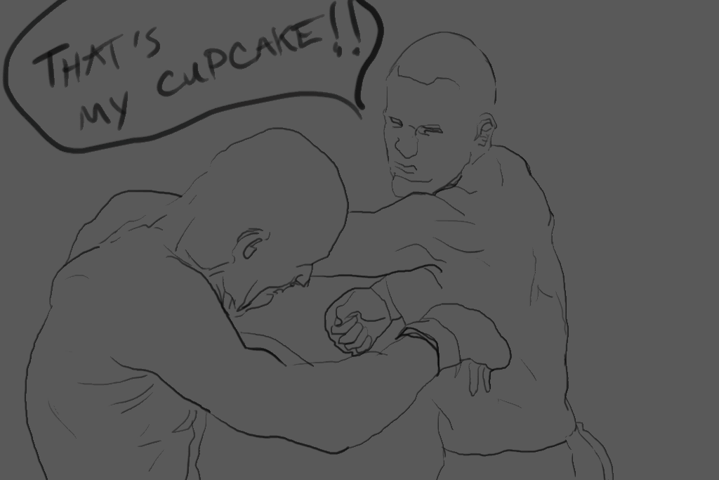
I love the forehead details on the fighter throwing the punch! Ka-pow!
Hey dude, thanks for the love. Those boxers look pretty good, but mind the metallic look of the skin. If that's intentional, I didn't say anything :p
Gerald:
Thanks!
Lennart Verhoeff:
My pleasure. Look forward to more of your entries!
They do indeed look rather shinier than the norm. At this stage my only intention is get the form and likeliness down, but I absolutely need to push rendering out skin to appear more natural. Thanks!
These are looking real good dude. I would just say give a little more love to your edges. There is so very much variety to edges for so very many reasons.
Tom Scholes:
Hey! Thanks for dropping by. It has been a while. Heh. Absolutely. Edges can do so much and at the same time so little. I appreciate the advice! I'll have to incorporate them in future studies.
Post a Comment